Power BI
Titanic Survival Analysis Dashboard
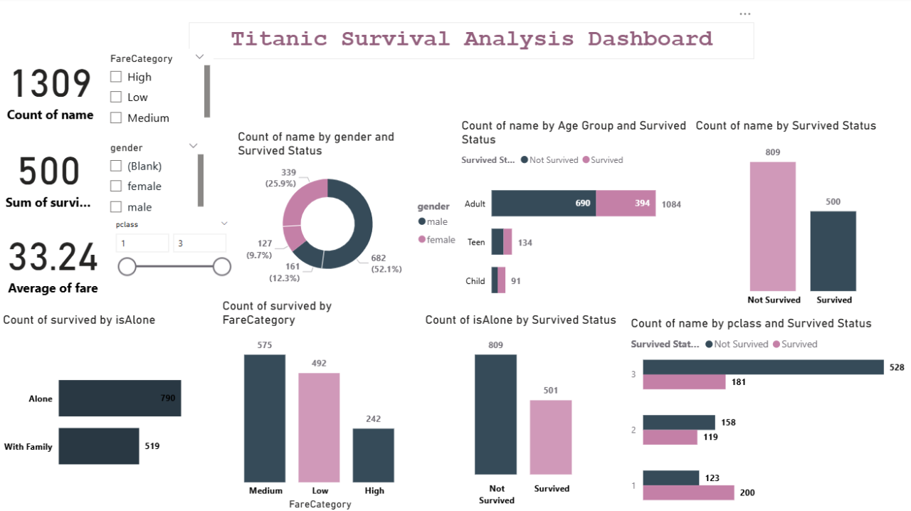
Interactive Power BI dashboard exploring survival patterns from the Titanic dataset across gender, age group, class, and fare category.
Power BIPower QueryDAX
Business problem
The raw Titanic dataset is rich but hard to interpret without segmentation — stakeholders needed a visual way to explore who survived and why.
Solution
Cleaned and modeled the data in Power Query, engineered Age Group and Fare Category features, and built an interactive dashboard with slicers for gender, class, and fare tier.
Key insights
- Overall survival rate was ~38% (500 of 1,309 passengers)
- Females survived at a much higher rate than males across all classes
- First-class passengers had nearly double the survival rate of third-class
- Passengers travelling with family survived more often than those alone
Business impact
Turned a static training dataset into a self-serve exploratory dashboard used to demonstrate segmentation, DAX, and storytelling with data.
Next project
B2B Sales Performance Dashboard